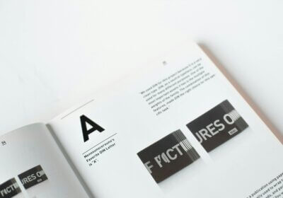
Based on the very known concept of ‘less is more’, minimalism represents the action of identifying the basic elements we need in our life and putting aside the excess. This concept has been around for centuries, yet somehow it became quite popular nowadays and can be expanded to almost everything. From way of living, interior design, clothing, we can talk about minimalism even when it comes to fonts.
Because we appreciate the power of simplicity and the impact it brings to our lives, we decided to make a quick selection of minimalist fonts. Not only they will come in handy in various situations, but they will also take your design to another level.
Poppins
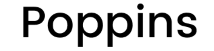
Simple, with smooth curves and no serifs. Would look good on leaflets or in magazines, right?
Futura

This bold font surely stands out. We think it might go well for titles and headings.
Montserrat
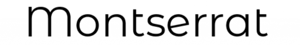
Without a doubt, this font has got a certain vibe to it. It looks so different and simple that we couldn’t help but add it to our list of favourites.
Gotham
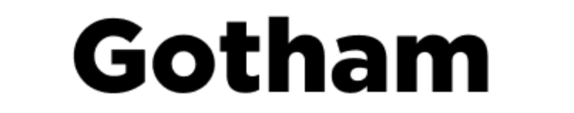
This font makes us think about Batman and the famous Gotham city. Are we the only ones around here doing that?
Lato

It surely looks very serious, so we couldn’t even imagine seeing it in a different tone of voice other than the formal one.
Open Sans
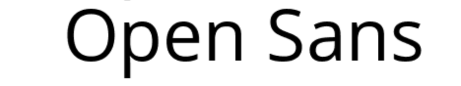
Still better than Comic Sans, right?
Avenir Next
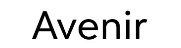
There’s beauty in simplicity. And this font is quite a good example for this saying.
Roboto

Very bold and easy to spot, this font is definitely the star of the show.
San Francisco
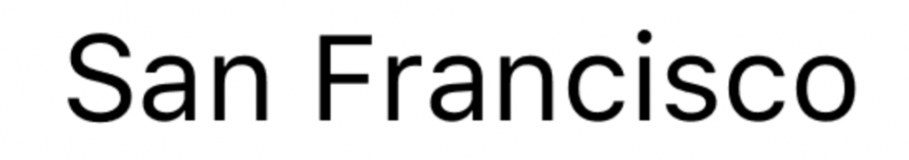
We don’t know if it was inspired by the beauty of the West Coast, but it surely has got something that caught our attention.
Noto Sans
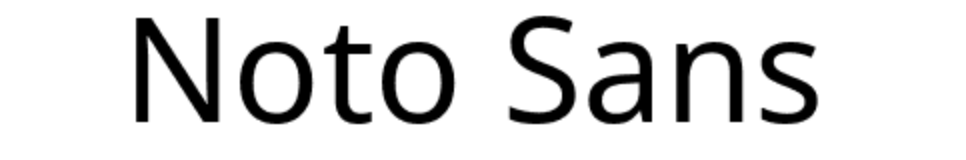
Last, but not least, we have arrived to number 10. There are never enough minimalist fonts, are there?
Whether you’re curious to search for more minimalist fonts or you plan on spicing things up and choose a different font style, WhatFontIs.com will be there for you. You’re just one click away from a sea full of fonts, so take a dip and discover new sources of inspiration daily.