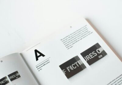
If you are a travel junkie, you definitely must’ve heard about Airbnb. The online housing marketplace has been around for 11 years now, with no intentions of going anywhere in the near future. However, its identity hasn’t always been the one we are familiar with right now. In 2014, Airbnb went through a rebranding process, unveiling a fresh and relatable identity. With no further ado, let’s dig into this story and find out the most significant aspects of this new identity.
How it all begun

On the 16th of July 2014, Airbnb introduced the world to its new and improved identity. The new positioning, Belonging Together, gave the brand a new whole new meaning. ‘Belonging has always been a fundamental driver of humankind. So to represent that feeling, we’ve created a symbol for us as a community. It’s an iconic mark for our windows, our doors, and our shared values. It’s a symbol that, like us, can belong wherever it happens to be’, declared Brian Chesky, founder of Airbnb.
In order to come up with a identity that could speak up for the brand and to the community, four members of the creative team pursued on a journey. They visited 13 cities from four different continents and met 18 different hosts. The result? Something that shaped the way we understand travel.
The visual representation
The new identity on fonts
Firstly, this new identity needed a fresh new font. The previous logo was designed by one of the owners of Airbnb. In order to write down the brand’s name, he used a font called Bello. Although it looks nothing like the current one, it somehow managed to send out a sense of comfort and casualness which helped at developing the brand’s new image.
Through its appearance, the 2014 logo managed to attract a more mainstream audience and to create brand awareness. For this new logo, the designers used a font from a particular font family: Lineto. Thus, the brand’s name is written in a customized version of Lineto’s Brown font, while other messages are written in a customized version of Lineto’s Circular. Check out a pretty similar font called Smooth Circular! It’s a nice and clean sans serif font that you must keep in mind.
The new identity on colors
Secondly, another step in redesigning a brand’s image is choosing a representative color. Or, if you are really creative, coming up with one. The main color that stands for Airbnb is called after the street where everything started: Rausch. Pretty cool, right?
The new identity on logo
Finally, let’s focus our attention on the brand’s new logo. Commonly know as ‘The Bélo’ – remember the whole belonging concept, right? – the logo is an abstract representation of four ideas: people, places, love and Airbnb. They are beautifully blending together in an A shaped logo. You can check out a short video about ‘The Bélo’ here.

To sum up, when it comes to the travelling community, this new face of Airbnb has the potential of becoming as famous as the WIFI icon. Or the Apple’s logo. In addition, besides all this sense of community that this new identity indulges, Airbnb made us aware of one significantly important thing. It matured and it has the ambition to become a worldwide known brand. In other words, this change was beneficial.
However, do you think that changing the identity of a brand should begin with a new logo? While you think about an answer, check out whatfontis for lots and lots of fonts that can come in handy for your creative project!


