Nowadays, brands tend to change their appearance more often. They can come up with a new logo or a reinterpreted version of the old one (by the way, have you read the story about Zara and its new logo?). They can think of a new slogan. Or they can sweep us off our feet with an entire “new look”. When talking about beneficial change, Mastercard is a pretty good example. Why? Well, let’s find out. Mastercard came up with this new logo.
The older logo
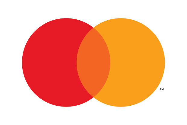
Since 2016, the Mastercard logo is represented by two imbedded circles: a red one and a yellow one. The brand’s name is sitting under those circles, written in a sans serif font ( if you like this font, check Axioma Medium – it’s pretty similar). Even though the logo itself is pretty easy to recognize, we can call this a transition period.
Change was the main drive that influenced the new Mastercard look. Nowadays, we live in something that can be easily identified as a digital era. We want more and we want to achieve that more in a simpler, efficient way. We appreciate novelty and we embrace change easily. And last, but not least, we live in the present while thinking about the future.
With no further ado, these characteristic are the main reasons brands need a refresh. So, in order to identify itself with its audience, Mastercard came up with this logo. A logo that represents simplicity, authenticity, connectivity and modernity.
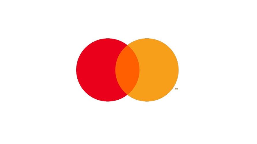
The new Mastercard logo
At the beginning of 2019, Mastercard dropped a new logo: one that’s missing the brand’s name. Pretty bold move, right? Well, Mastercard conducted a research for almost two years before making that decision. As a result, they found out that people easily recognized the sole logo, without needing to see the brand’s name underneath it.
After coming to these result, Mastercard was finally ready for this big and significant change. The brand was ready to accept the fact that its omnipresence led to instant recognition of the brand. Also, by embracing this change, Mastercard is getting ready to take over the post credit-card world. How is that, you might ask?
With an easier to read logo (you don’t actually need to read it, right?) on digital screens, placing Mastercard among those elite brand that don’t really need a name underneath them to be recognized.
Are you aiming to achieve an instant recognizable logo? Follow Mastercard’s example and embrace change step by step. You can start with switching to a modern font. Therefore, we have great news: WhatFontIs is here to help you with lots of fonts. Here, you can find over 500k fonts. Check them out and tell us which one is your favorite!