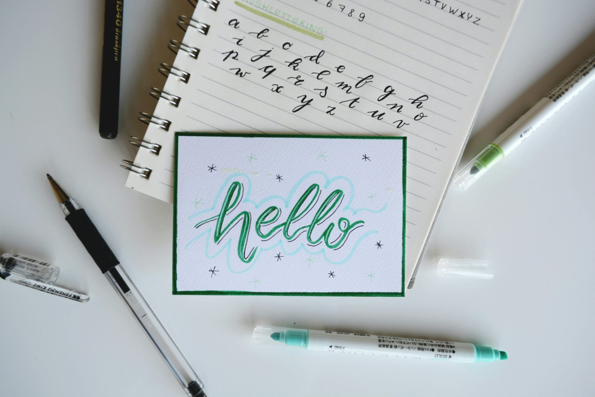
Over the past several years, handwritten fonts have become known as a popular option among designers and businesses due to the unique allure that they provide. Their organic, flowing lines and unique personalities offer a refreshing contrast to the sometimes boring similarity of traditional fonts. The growing need for authentic and emotionally engaging designs is believed to be the driving force behind the rapid surge in popularity.
Handwritten fonts have their drawbacks, but they also have their charm. While handwritten fonts add personality and attractiveness to a project, they can also make it more challenging to read, especially when the typefaces are smaller or the layout is more sophisticated. Furthermore, because of the subjective nature of handwriting, which can result in inconsistencies, it may be difficult to build a clear brand image.
In this article, we are going to discuss the complex structure of handwritten fonts, as well as the pros and cons of incorporating them into design projects. We will explore strategies to optimize the aesthetics by maximizing their advantages and minimizing their disadvantages. By gaining an understanding of the subtleties of handwritten type, you can improve your decision-making abilities and generate designs that are more successful. This is what you need to know.
Pros of using handwritten fonts
The usage of handwritten fonts has the potential to bring design projects to an entirely new level of elegance. Compared to the dusty similarity of traditional designs, the organic, flowing fonts and unique personality of these types offer a refreshing change. The increasing demand for authentic and emotionally engaging designs could potentially account for this rapid growth in popularity.
The personal touch of handwritten fonts is one of their many benefits. Through the process of imitating the natural variety and imperfections of human handwriting, these typefaces have the ability to make a design appear more genuine and approachable. Companies that are looking to establish an emotional connection with consumers will find that this works wonderfully for them. Through the creation of feelings of warmth, trust, and intimacy, the use of handwritten fonts has the potential to deepen the connection that exists between the business and its employees and customers.
One more element that makes handwritten fonts appealing is their versatility. Their use allows for the creation of an extensive range of atmospheres and emotions. As an illustration, a writing style that is powerful and dynamic could express feelings of excitement and urgency, whereas a design that is smooth and flowing can bring up feelings of romanticism or nostalgia. Handwritten typefaces are ideal for projects dedicated to a younger audience due to their playful and entertaining tone.
Through the utilization of handwritten typefaces, which appear to be handwritten notes or letters, it is possible to communicate a sense of importance to the recipient. The use of this could be enormous in the production of promotional materials, invitations, and other messages. Handwriting provides personalization, which can enhance the message’s impact.
Cons of using handwritten fonts
Although handwritten typefaces are eye-catching, there are several disadvantages to utilizing them that you should be aware of. One of the most significant disadvantages of handwritten fonts is their problems with readability, particularly in smaller formats. Stroke width and letter spacing can vary in handwriting because of its organic nature. This can be distracting and challenging to read, especially in dense blocks of text. Projects that necessitate a large amount of textual information, like websites and brochures, face an especially difficult challenge with handwritten fonts.
Another concern is the compatibility of the handwritten font with other typefaces. Because of their unique characteristics, handwritten fonts may be difficult to blend in with more traditional typefaces. When the item’s style and weight aren’t a suitable fit, it can give an unprofessional vibe. Carefully choose fonts to enhance the overall design without overpowering the handwritten element. It is crucial that you stick to this practice!
Another problem is that handwritten typefaces are not always simple to come by. However, the creation of handwritten fonts often needs specific license arrangements. In contrast, large font providers typically offer conventional typefaces. This means that certain fonts can be out of reach financially.
How to use handwritten fonts effectively
There are several things you can do to make sure you’re making good use of a handwritten font if you decide to use it in your design. It is recommended to use a handwritten font moderately. You shouldn’t use this for every single word of your content. Use it instead for headings, subheadings, and other brief passages of text.
Choose a legible and easy-to-read handwriting font. There is an enormous selection of styles and colors available for the handwritten fonts. Some handwritten fonts are easier to read than others. Make sure the font you choose is simple to read even when reduced down to a smaller size.
Choose a handwritten font that complements your current work. Some types of handwriting are more subtle than others. Select a font that harmonizes harmoniously with the project’s prevailing tone and style.
Always stay true to the brand’s aesthetic when writing by hand. To maintain your brand’s identity, all of your promotional materials should have the same look and feel. If you use a handwritten font on your website, you should maintain consistency throughout all of your marketing materials, including social media.
Handwriting fonts that are readable
It is possible to sprinkle your designs with a sense of personality and warmth, so making them more engaging and memorable, by utilizing the following handwritten fonts:
- Pacifico: This font has a relaxed, friendly feel and is easy to read, even in small sizes.
- Lobster: A playful and slightly condensed font that remains highly legible.
- Dancing Script: Elegant and flowing, yet maintains good letter spacing for easy reading.
- Great Vibes: A casual and slightly condensed font with good character recognition.
- Alex Brush: A classic brush script with clear letterforms and good contrast.
- Satisfy: A bold and condensed font that remains surprisingly readable.
- Reenie Beanie: A fun and quirky font with good letter spacing and clear shapes.
- Homemade Apple: A charming and informal font with good legibility.
- Permanent Marker: A marker-style font with strong, easily distinguishable letterforms.
Now that you know what handwritten fonts are and how they work, you can pick the perfect one for your project! If you’re lost and can’t decide how to begin, maybe you’ve spotted a lovely handwritten font online, but can’t figure out its name. We may be able to help you with that.
When you need a font identified, WhatFontIs.com is the way to go. If you’re looking for a Google Font or a rare commercial font, WhatFontIs.com will help you find them.
All you have to do is upload a picture of your preferred font, and that’s it! Find the perfect font match with the help of WhatFontIs.com. With only a few clicks, you can give your designs that extra something that makes them unique.