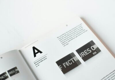
Fonts are so much more than just the words that are printed on a page, despite the fact that you might think of them as such. They may influence our feelings, set the tone, and transform our perceptions of a product or brand.
Fonts, when applied effectively, have the ability to transform a straightforward design into an experience that is both playful and enjoyable. Picture a children’s book that has a font style that is boring and sober. Isn’t that something that wouldn’t be very exciting? But if you use a font that is creative and bright, it could bring about feelings of excitement and imagination.
In this article, we will go deeper into the topic of fonts and explore how to use them to create designs that are not only visually appealing but also emotionally stimulating. We will look at the psychological bases of fonts, study how to select the most appropriate font for any given project, and learn how to blend fonts with color and layout to have the most possible impact.
This guide will give you useful advice and ideas that will help you take your designs to new levels of fun and creativity, regardless of whether you are an experienced designer or just beginning out in the field. Now that we have that out of the way, let’s get started and unleash the joyful power of fonts!
Why do fonts matter?
Before we get into the details of how to use fonts to generate a sense of playfulness and fun, it is essential to have a solid understanding of the psychology behind fonts. Not only are fonts components that are visually appealing, but they are also psychological aspects that have the ability to elicit particular feelings and connections.
For instance, research has demonstrated that individuals have an inclination to view fonts with rounded edges as being friendlier and more approachable than fonts with sharp edges. This is due to the fact that sharp edges are associated with feelings of coldness and toughness, while rounded edges are associated with feelings of warmth and relaxation.
Sharp edges induce an instantaneous reaction from humans: danger. If something is sharp, it will hurt, and associated feelings include pain, fear, and disconnection. Your brain will automatically prefer rounded edges to sharp ones, even if it’s only on your gadget screen.
What is the opposite of the word “danger”? That’s right. Risk-free. People tend to feel more comfortable, welcoming, and safe around spaces with rounded corners. There is no danger or chance of harm due to the smooth curves. Again, this form has a greater impact on your brain’s connectivity and adaptability, even when it’s only on your smartphone screen.
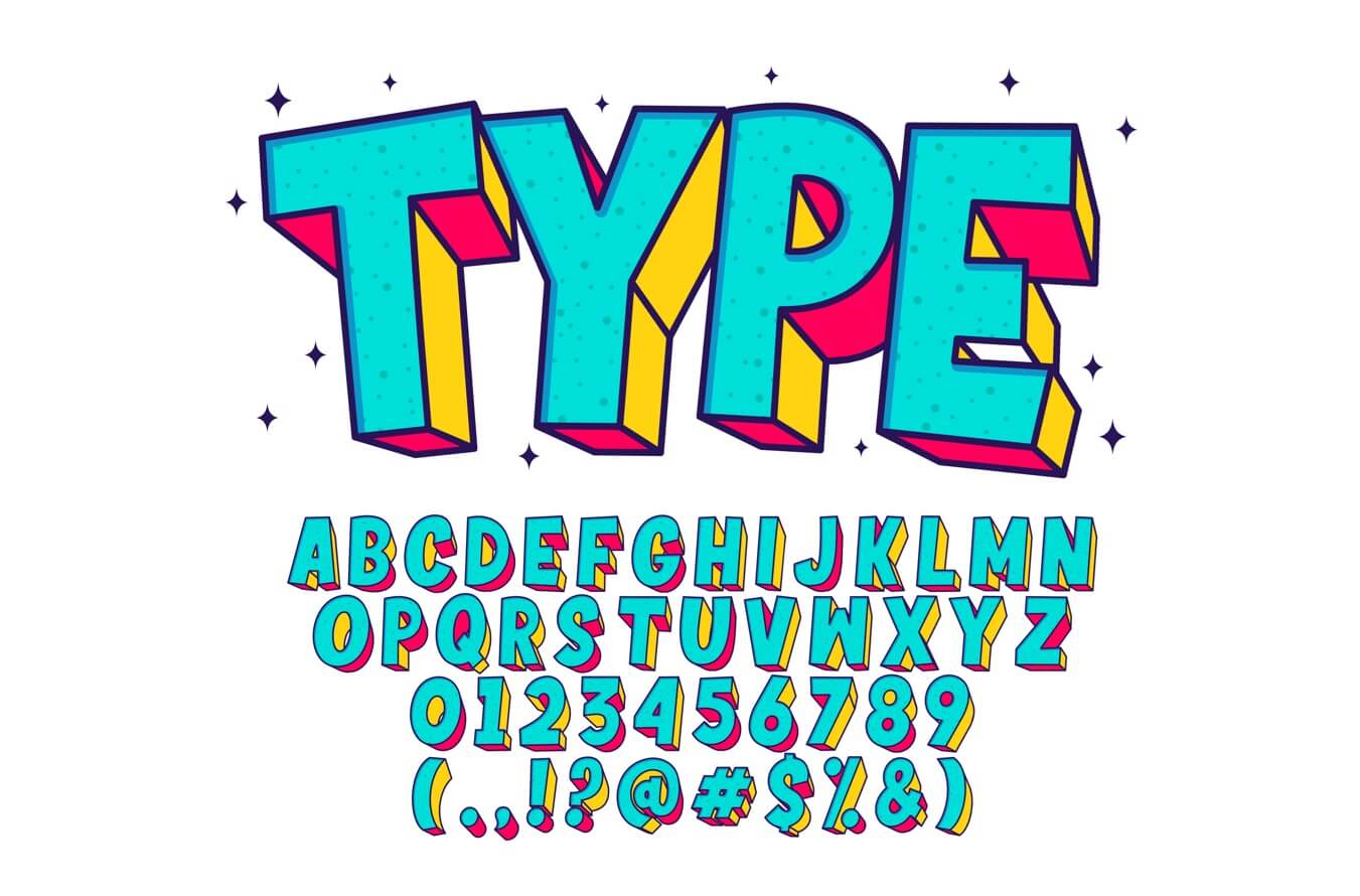
In the same way, fonts that have a high degree of contrast, such as those with bold and thin strokes, are considered to have a higher level of vitality and energy compared to fonts that have a low degree of contrast. Specifically, this is due to the fact that strong contrast generates a feeling of dynamism and excitement.
It is essential to take into consideration the psychological influence that the font will have on your audience when selecting a font to generate a sense of playfulness and fun as part of your design. When selecting a font, you should focus on choosing one that will stimulate positive feelings and generate a sense of excitement and happiness.
How to choose the right font that induces playfulness and fun?
The choice of an ideal font follows a description of an idea for a design. You can think of fonts as the personality of your design, so that selecting the proper font can give it a bold, playful, or beautiful appearance.
Font type: serif vs. sans-serif
Serif fonts have a more conventional and traditionally formal look about them. You can use them for playful designs, but they really shine when applied to more serious or classic styles.
Sans-serif fonts are less formal and more contemporary because they lack serifs. They might be innovative, eccentric, or just plain entertaining, making them ideal for creative designs.
Font weight: bold or light?
Bold fonts are thicker and more eye-catching. Use them to highlight headlines, titles, or anything else you like.
Light fonts are thinner and more delicat. These kinds of types are called light fonts. For a more understated style or for use in body text, they work wonderfully.
Font style: the finishing touch
Decorative fonts are characterized by a high degree of stylization and a lively attitude. Be careful not to use too many of these at once because they can be hard to read in bulk.
Keep in mind that thinking about the tone and message you want to express is crucial when selecting a typeface. Making designs that are aesthetically pleasing and emotionally engaging is as simple as picking the right font.
Here are a few examples of fonts that are well-suited for creating a sense of playfulness and fun:
- Sans-serif fonts:
- Script fonts:
- Decorative fonts:
The secret ingredients for playful designs are fonts and colors
You can now add some color and flair after you’ve chosen the ideal font. Color is a potent instrument for stirring up feelings. Optimism and carefree spirit are brought out by vivid, cheerful colors such as pink, orange, and yellow. Having an excess of hues, though, could be distracting. If you want your design to be straightforward but effective, use only a few colors.
Your design’s layout is just as crucial. Asymmetrical layouts are lively and fun, while symmetrical ones might be serious and official. Try out a few styles until you find one that suits your design. The empty space surrounding your design elements, known as white space, can also help create an exciting vibe. A less crowded and more welcoming design is possible with its help.
Examples of fun fonts in use
Kids’ books are a great place to find real-life examples of playful typefaces in use. They like eye-catching, vibrant fonts that are both legible and interesting to read. One more excellent example would be cereal boxes. To pique kids’ interest and provide the impression that the product is more entertaining, they utilize funny fonts.
Marketers also employ funny typefaces to make their advertisements stand out. Imagine a humorous and eccentric advertisement for a second. It probably caught your eye because of the unique font it utilized. To create a playful and welcoming ambiance, websites, particularly those targeting children, choose fonts that are fun and animated. To make designs that are both aesthetically pleasing and emotionally engaging, designers must master the art of font selection.
Have you come across a font that you like but are unsure of its name, so that you can utilize it in a creative manner? WhatFontIs.com is here to save the day! Using this helpful tool will make it much simpler for you to create the ideal design that you have imagined for your playful project! You are already here, try it now!