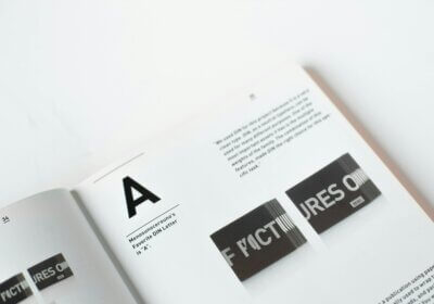
In the complex domain of technical documentation, where clarity and accuracy rule first, the apparently small element of font choice becomes a major determinant of the whole reader experience. Far beyond a simple aesthetic decision, the fonts used in a technical paper can greatly affect its reading, comprehension, and eventually efficiency.
A well-chosen font can simplify difficult technical material into a digestible form, therefore decreasing the workload and improving understanding. On the other hand, a poorly chosen typeface can cause discomfort for the eyes, hide meaning, and perhaps result in critical mistakes. The best font is not a one-size-fits-all fix but rather a strategic option that calls for careful thought of several elements, including the target audience, the goal of the document, and the particular information being expressed.
The article explores the subtle aspects of font selection in technical documentation and investigates the main ideas guiding font choice, common mistakes to avoid, and best practices to guarantee that technical papers are not only useful but also visually attractive and easily navigable. Technical creators can improve their works to unprecedented levels by knowing how fonts affect readability, correctness, and general user experience, therefore promoting clarity, comprehension, and finally, the effective spread of technical knowledge.
How to use fonts as a technical writer
Knowing the basic elements of a font helps one to choose fonts for technical papers with accuracy. Often subtle but powerful, these components greatly help a document to be aesthetically pleasing and generally readable.
Traditional and formal fonts are typified by serifs, like Times New Roman or Georgia, for printed products and long text due to their apparent elegance and simplicity of reading. Sans-serif typefaces, on the other hand, give a cleaner and more modern look even if they lack these artistic strokes. Common sans-serif fonts used extensively in digital documents and screen-based reading because of their clarity and legibility are Helvetica, Arial, and Verdana.
Especially in smaller font sizes, the x-height, meaning that height of lowercase letters excluding ascenders and descenders, plays a crucial part in readability. Greater x-height improves the visual weight of lowercase letters, therefore increasing their clarity. On digital devices, fonts having a higher x-height, Verdana or Calibri, can increase readability.
A font’s apparent strength and visual impact depend on its weight, that is, its stroke thickness. To highlight certain material, establish a visual organization, and direct the reader’s attention, employ diverse weights, regular, bold, and italic. Understanding these basic elements helps technical writers choose fonts that best maximize the readability and general efficacy of their writings.
Things to keep up in mind when choosing fonts for technical documents
A consistent font choice throughout the entire manuscript is most important. When there are too many distinct fonts, it might cause the readers to lose flow and make it harder for them to grasp. The correct distance between letters and words is another significant factor that contributes to the improvement of reading and the reduction of eye strain.
Accuracy is yet another factor that is vital. Selecting a font that can accommodate the required character set is crucial, particularly when the document contains mathematical symbols, code snippets, or characters from a foreign language. It is of the utmost importance to check that the typeface accurately generates symbols, subscripts, and superscripts, which are all considered special characters.
Focus and clarity can be achieved by choosing the right font. Format headings and subheadings in distinct, easy-to-read fonts to establish a hierarchical structure. People frequently select sans-serif fonts for headlines due to their bold and modern appearance. Fixed-width fonts, such as Courier New or Consolas, are ideal for displaying code snippets and syntax highlighting. This is because they maintain consistent spacing and enhance the readability of the code. It is possible to emphasize specific ideas or keywords by using bold, italics, or underlining.
It is imperative that technical documents are easily accessible. When it comes to readers who have visual difficulties, following the recommended font sizes is helpful. Larger font sizes are more readily available. The background and text color should contrast enough to make reading easier. Typically, people prefer the combination of dark text on a light backdrop or vice versa. Additionally, the choice of typeface, serif or sans-serif, can influence accessibility. Despite the fact that some studies suggest that serif fonts may be better readable for printed texts, it is possible that sans-serif fonts are more suitable for use on digital devices.
Errors to avoid when writing a technical document
Technical documentation often falls victim to the overuse of fonts. Using several fonts inside one document could visually clutter it and divert the reader from the information. Using a restricted number of fonts for headings, body text, code, and other sections keeps a uniform font palette.
Inconsistent font size is another frequent error. Different font sizes in body text and headings could upset the visual equilibrium and make reading difficult. Keeping constant font sizes guarantees a clean, professional look, particularly inside the same level of heading or text.
Another major error in technical documentation is ignoring branding rules, which can also compromise an organization’s professional reputation. Should your company have certain branding rules, you must follow them exactly in font choice. Fonts that fit the visual identity of the brand support the brand’s image and help preserve consistency.
Technical writers have the ability to generate articles that are not only precise and helpful but also visually beautiful and simple to navigate. Carefully selecting and utilizing fonts accomplishes this. If you follow these criteria, you will be able to guarantee that the technical documents you create are excellent instruments for communication and the transfer of information.
And if you are unsure about the name of a font that is ideal for your technical materials that you discovered online, all you need to do is take a screenshot of the text that was entered using that font and then allow the advanced search algorithms of our website, WhatFontIs.com, to do the rest!


