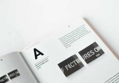
The design world is completely fascinated by the minimalism movement, which stands for simple shapes and few ornamentations. The goal of minimalist design is to create an experience that is both visually attractive and compelling. We achieve this by focusing on the primary message and eliminating unnecessary elements. Typography is the most fundamental component of any design, and it plays a significant role in the achievement of this straightforward style.
The wrong font will make your design look bad, but the right one will make it stand out. Within the framework of the minimalist style, the font serves a purpose that is more aesthetic than simply conveying information. Minimalist typography is characterized by its use of elements such as simple shapes, clean lines, and straightforward legibility. It is important to avoid using excessive flourishes, decorative elements, and letterforms that are difficult. On the other hand, it places an emphasis on simplicity, efficiency, and clarity.
In this article, we will go deeper into the guiding principles of minimalist typography, look at what minimalist fonts are like, and provide some useful tips for selecting and utilizing minimalist fonts in projects that are minimalistic. If you master these practices and concepts, you can create functional and attractive designs.
What, exactly, is a minimalist design?
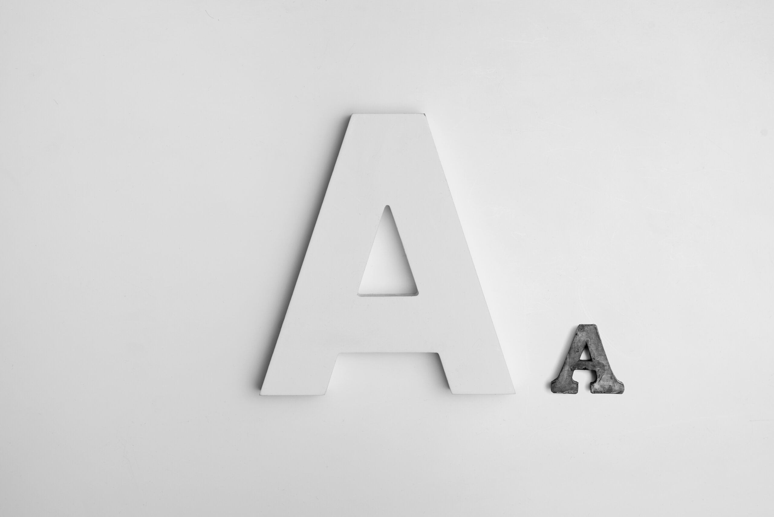
The aesthetic philosophy known as minimalist design places a value on readability, clarity, and simplicity during the design process. It does not make use of an excessive amount of decorations but rather goes for clean lines, simple forms, and a sense of moderation. Minimalist design aims to create a visually attractive and impactful experience by focusing on the fundamental components of typography.
The principle of simplicity is essential to the practice of minimalist typography. Having lines that are clean and uncluttered is vital for simple readability, while having fonts that are extremely elaborate or decorative might divert attention away from the message. The same is true for simple geometric forms. They are simpler to perceive and process, which makes them an excellent choice for minimalist designs. Limiting the use of font weights and styles in a design is crucial to preserve its integrity and avoid visual clutter.
The readability of minimalist typography is another essential component of this style. Reading is easier with distinct letterforms and enough space between them. Furthermore, a sufficient contrast between the font and the backdrop enhances readability, especially at smaller sizes. In addition, considering the ideal line length can contribute to improvements in both reading speed and comprehension.
Whitespace, also known as negative space, is a crucial element in minimalist design. Effective use of whitespace creates a sense of airiness and equilibrium, enhancing the overall visual appeal of the design. For the purpose of achieving the highest possible level of readability, it is vital to pay attention to the spacing between letters, words, and lines. Designers are able to create minimalist typographic designs that are not only visually beautiful but also highly practical if they give careful consideration to these ideas.
Tips for a perfect minimalist typography
When putting minimalist typography into practice, it is absolutely necessary to pay attention to a few fundamental guidelines. Initially and most importantly, less is more. Take care not to give in to the temptation of using an excessive number of fonts. Instead, restrict the number of font types you use in order to maintain consistency and avoid visual clutter.
Another essential component of minimalist design is the use of a color palette that is uncomplicated and constant. Reducing the quantity of colors employed can achieve a clean and focused design. Consistent alignment of text can also foster a sense of order and balance within the design framework.
The use of a grid system is an effective method for structuring your design and ensuring that the spacing is consistent throughout. You are able to build a layout that is both structured and harmonious by utilizing a grid. It is possible to generate a sense of lightness and equilibrium through the effective utilization of whitespace, which in turn can enhance the overall visual appeal of the design.
Nonetheless, it is essential to experiment with your design on a variety of devices and screen sizes in order to guarantee the best possible readability. Focusing on these basics will help you create beautiful and effective minimalist typographic designs.
10 most popular minimalistic fonts
If you’re not sure which minimalistic font would suit your design better, maybe our suggestions below will inspire you:
Roboto: A versatile and modern sans-serif font, perfect for digital interfaces and print designs. It’s clean, legible, and has a friendly appearance.
Open Sans: Another popular Google Font, Open Sans is known for its excellent readability and neutral appearance. It’s a great choice for body text and headings.
Lato: This sans-serif font strikes a balance between modern and classic. It’s elegant, easy to read, and has a warm, inviting feel.
Montserrat: Inspired by geometric sans-serif fonts, Montserrat is a clean, modern typeface with a strong, distinctive character. It’s ideal for headlines and branding.
Raleway: A thin, elegant sans-serif font that’s perfect for headlines and titles. Its elongated letterforms add a touch of sophistication to any design.
Helvetica: A timeless classic, Helvetica is a versatile sans-serif font that can be used for a wide range of design projects. It’s clean, neutral, and highly legible.
Futura: A geometric sans-serif font with a futuristic, bold appearance. It’s perfect for creating a strong, modern look.
Avenir: A versatile sans-serif font with a clean, modern aesthetic. It’s available in a wide range of weights and styles, making it suitable for various design applications.
Gill Sans: A classic sans-serif font with a humanist touch. It’s elegant, readable, and has a timeless appeal.
Source Sans Pro: A versatile sans-serif font designed for digital interfaces. It’s clean, legible, and has a modern, friendly appearance.
When used effectively, minimalist typography can help designers achieve simplified, effective results. Achieving a visually pleasing and effective aesthetic is as straightforward as picking the appropriate fonts and holding the fundamental principles of whitespace, readability, and simplicity. When it comes to minimalist design, less is usually more. By keeping things simple and avoiding unnecessary complexity, you can create designs that are both aesthetically pleasing and highly functional.
WhatFontIs.com is a trustworthy tool that can identify any font in seconds, so you can utilize it in your designs if you find a minimalist font online but don’t know its name. To quickly find the font you like, all you need to do is snap a screenshot of the text that was typed using that font. Our powerful search methods will do the rest!